6 Tips for Mixing and Matching Tile Colors and Patterns
February 2, 2024
When it comes to interior design, mixing and matching tile colors and patterns can serve as a cornerstone for creating a space that’s both unique and harmonious. Tiles are more than just practical; they offer a chance to inject personality and style into every room. Whether you’re tiling a kitchen backsplash or sprucing up a bathroom floor, the right combination of colors and patterns can transform a space. But where do you begin?
Understanding the nuances of color theory and the impact of patterns is essential in achieving a cohesive look. The key is to balance personal taste with timeless design principles. With these 6 tips, you’ll be equipped to make selections that not only reflect your style but also stand the test of time.
Unveiling the Secrets to Tile Harmony
Embarking on the journey of tile selection might seem daunting at first, but we’ll guide you through the process. To start, consider the mood you want to set. Do you want a serene retreat or a vibrant space full of energy? This mood will be your guidepost for choosing the right colors and patterns.
Next, evaluate the size of your space. Lighter colors can make a small room feel larger, while darker hues create a cozier atmosphere. Patterns also play a critical role; large patterns can overwhelm a small space, but when used wisely, they add character and depth.
Tip 1: Balance is Key in Tile Design
Finding the perfect equilibrium between tile colors and patterns is an art. Start with a base color that anchors your space. This can be a neutral or a subdued hue that resonates with the overarching theme of your room.
Once you have your base, it’s time to incorporate accent colors. These should complement your primary color and can be bolder to add visual interest. Patterns can then be introduced sparingly, as too many can create a chaotic look. The aim is to strike a balance that pleases the eye.
Tip 2: Understand the Color Wheel
Before diving into your project, a solid understanding of the color wheel can prove invaluable. Complementary colors, which are opposite each other on the wheel, can make each other pop, while analogous colors, which sit side by side, create a more harmonious feel.
Utilizing this knowledge, pick your tiles in colors that either contrast or blend with one another, depending on the effect you’re aiming for. A bold statement is made with complementary colors, while a subtle elegance can be achieved with analogous hues.
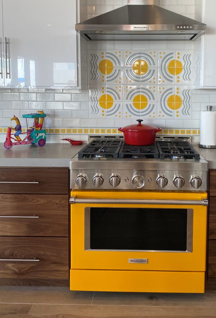
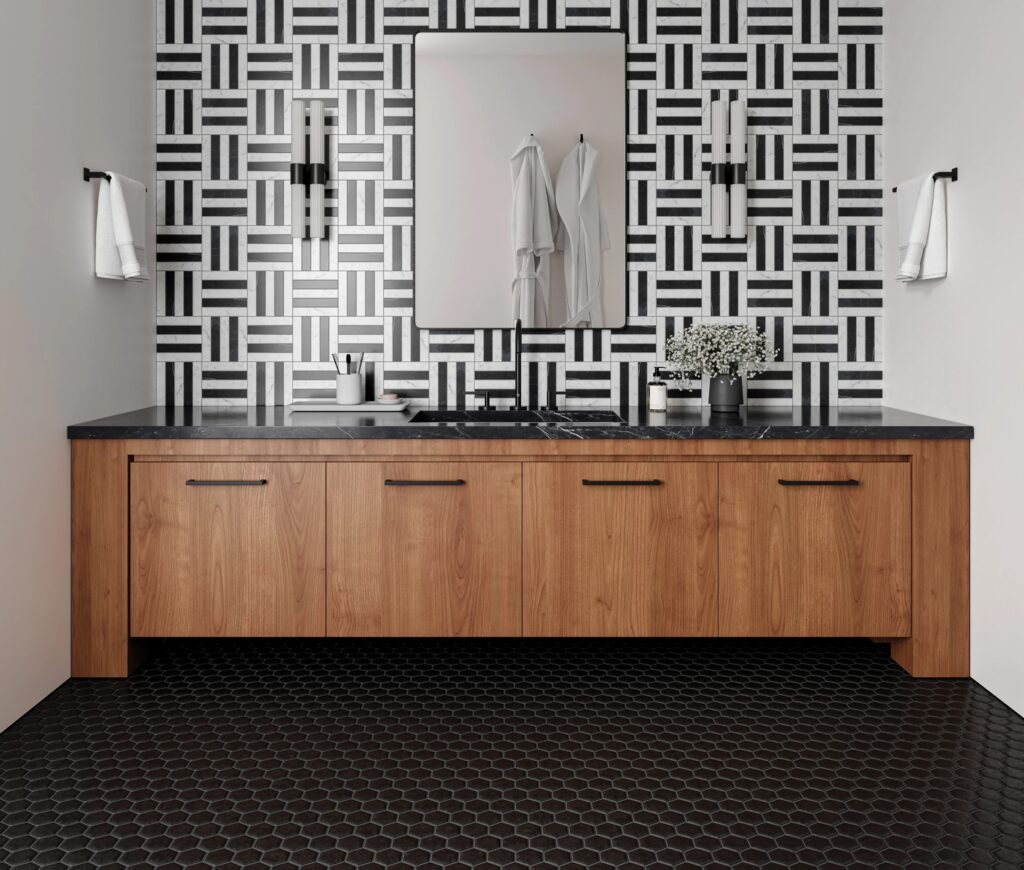
Patterns that Elevate: More Than Just Geometry
Patterns should not be an afterthought. Choosing the right pattern can elevate the design and inject life into the room. Geometric patterns bring a modern touch, while traditional designs can impart a classic elegance.
When mixing patterns, keep the scale in mind. A mix of large and small patterns can work if they are properly balanced. It’s also crucial to limit the number of different patterns to avoid a disjointed appearance. Instead, aim for a cohesive look where each pattern complements the other.
Tip 3: Cohesion in Tile Pairing
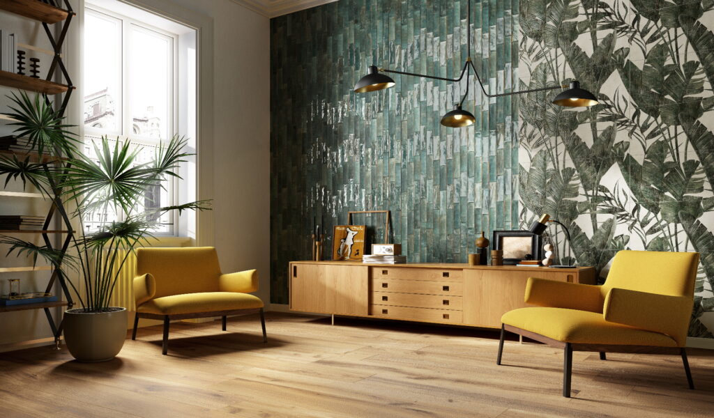
Cohesion can make or break the visual appeal of your tiled space. To achieve this, consider using one pattern in different scales or inversely, one scale with varying patterns. This can create a dynamic yet unified look.
Another approach is to choose a single color palette and play with different shades and tones within it. This method allows for flexibility in pattern mixing while maintaining a cohesive color story throughout the space.
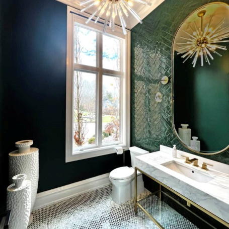
Tip 4: The Texture Factor
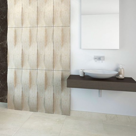
Tiles aren’t just about color and pattern; texture also plays a pivotal role. Matte finishes offer a subtle, contemporary look, while glossy tiles can add vibrance and depth.
Consider using textured tiles as an accent feature or as a means to add sensory warmth to a room. The interplay of light and shadow on textured tiles can bring a pattern to life, giving the space a unique character.
The Rule of Three in Tile Selection
The Rule of Three is a classic design principle that suggests that things arranged in odd numbers are more appealing and effective. Apply this rule by selecting up to three colors or patterns to use throughout your space.
This doesn’t mean you’re confined to just three tiles. Instead, think of it as a guideline for creating visual hierarchy in your design. You can have a primary pattern supported by two secondary ones, or a main color accented with two complementary hues.
Tip 5: Consider the Room’s Function
When selecting tiles, always keep the room’s function in mind. A busy kitchen floor might benefit from darker colors that conceal dirt, while a spa-like bathroom might call for soothing tones and gentle patterns.
Moreover, consider the maintenance of the tiles. High traffic areas require durable, easy-to-clean tiles, while accent areas can afford more delicate or ornate options.
Tip 6: Mock-up Your Vision

Before finalizing your choices, create a mock-up. This can be a physical layout of the tiles or a digital one. Seeing the colors and patterns in situ will help you determine if they work well together and suit the intended space.
Adjustments are part of the process. Don’t hesitate to swap out one pattern for another or adjust your color scheme until the combination feels just right.
FAQs About Mixing and Matching Tiles
1. What are the first steps I should take when choosing tiles?
Begin by considering the mood and atmosphere you want to create in your space. Assess the room’s size, as this will influence your color and pattern choices. Starting with a base color that reflects the room’s purpose and your style is essential. Then, think about the practicality of the tiles for the specific room you’re tiling.
2. How can I make sure the tiles I choose won’t go out of style quickly?
For longevity in tile design, opt for timeless colors and patterns that complement the architectural style of your home. Use trendy colors and patterns sparingly, perhaps as accent tiles, to ensure that your space remains classic and adaptable to changing decor styles.
3. Can I mix matte and glossy tiles together?
Absolutely! Mixing matte and glossy tiles can add depth and interest to your space. Balance is crucial; consider using glossy tiles as a highlight and matte tiles for larger areas to avoid overwhelming the senses.
4. Are there any rules for mixing tile sizes?
While there aren’t strict rules, a good practice is to maintain a consistent grout line width between different sizes. This creates a cohesive look even when using various tile sizes. Also, consider the scale of the room to ensure the tile sizes are proportional.
5. How do I avoid making my space look too busy with multiple patterns?
To prevent a busy look, limit your pattern choices and consider using them in different scales. Maintain a consistent color palette throughout the patterns to achieve harmony. Use patterns strategically to draw attention to focal points rather than saturating the entire space.