Choosing Tile Colors for Your Kitchen: Complementing Cabinetry, Appliances and Decor
October 24, 2024
When designing or renovating your kitchen, tile selection plays a vital role in creating a cohesive, beautiful space. With so many colors, patterns, and materials available, the process of choosing the right tile can feel overwhelming. This guide will walk you through everything you need to know about selecting tile colors that complement your cabinetry, appliances and decor. We’ll also explore different tile materials—like ceramic, porcelain, natural stone, and glass—and how to mix and match colors to create a kitchen that’s both functional and visually stunning.
Matching Tile Colors with Your Kitchen’s Core Elements

1. Coordinating with Cabinetry Colors
Your cabinets are a dominant feature in the kitchen, so the color of your tiles should work harmoniously with them. Here are some ways to pair tiles with cabinetry:
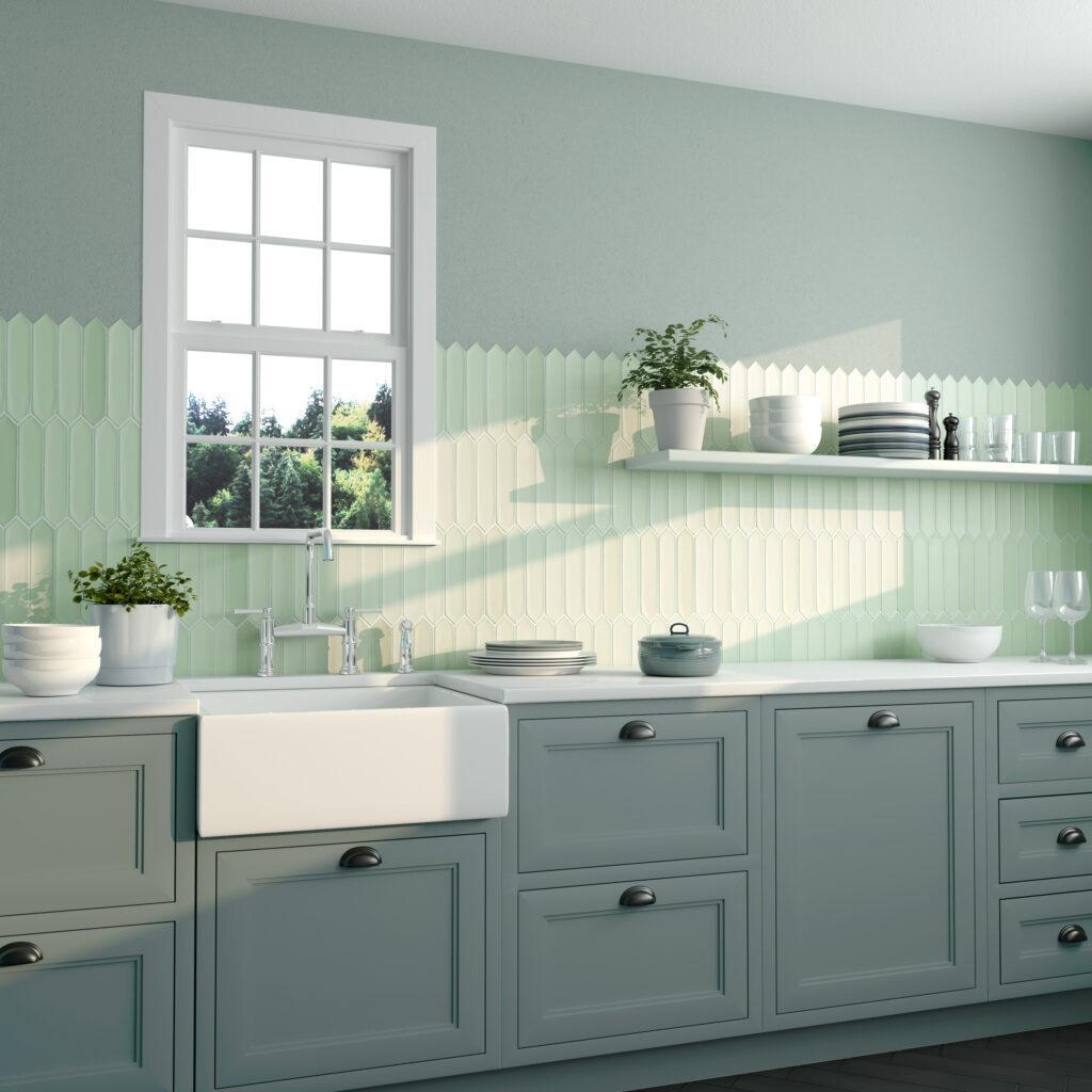
- Light Cabinets (White, Beige, Pastels): To maintain a bright and airy atmosphere, opt for soft hues like pale blues, mint greens or subtle greys in your tile. If you want contrast, try darker color tile such as charcoal, navy or even black tile to ground the look.
- Dark Cabinets (Espresso, Black, Navy): Lighter tile colors, such as cream, soft grey or white subway tiles, offer beautiful contrast. Alternatively, using warm, earthy tones like taupe or beige adds a cozy feel.
- Wood-Finished Cabinets: Natural wood tones pair well with both neutral and earthy tiles. For example, porcelain tiles in warm beige or honey tones can highlight the richness of wood grains, while green or blue tiles introduce subtle contrast.
2. Complementing Appliances
Appliances such as stainless steel ovens, refrigerators, and dishwashers influence tile color choices.
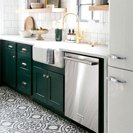
- Stainless Steel Appliances: Cool-toned tiles like grey, white, and blue provide a sleek, modern look. Alternatively, metallic or glass mosaic tiles can complement the reflective quality of stainless steel.
- Colored Appliances (Matte Black, White, Retro Colors): Choose neutral tiles—like beige or cream—for colored appliances to create a balanced look. If you want a bolder style, select a tile in a complementary color. For example, pair a teal appliance with navy tiles or a red appliance with white tiles.
Color Patterns That Work Well Together in Kitchens
Selecting colors that flow seamlessly through the kitchen creates an inviting and harmonious look. Here are a few tried-and-true combinations:
- Monochrome Palette: Stick to varying shades of a single color for a subtle yet cohesive design. For example, use different shades of grey for the backsplash and floor tiles.
- Complementary Colors: Choose two colors opposite each other on the color wheel (e.g., blue and orange, or green and red) for bold contrast. This approach works well for backsplashes if you want to make a statement.
- Neutral with a Pop of Color: Use neutral tiles (white, grey, beige) for most of the kitchen, but incorporate a bright accent tile for the backsplash or island area. A pop of turquoise, mustard, or coral can energize the space.
Where to Use Different Tile Colors in the Kitchen

The placement of tiles impacts the overall look and feel of your kitchen. Here are strategic areas where color choices matter:
1. Backsplash Tiles
The backsplash is an opportunity to add personality to your kitchen. You can use bold colors and intricate patterns that might feel overwhelming on larger surfaces. Glass tiles in vibrant colors or patterned ceramic tiles make excellent backsplashes.
- Bright and Bold: Opt for a statement tile with bright hues if the rest of your kitchen has neutral cabinets and countertops.
- Subtle and Neutral: If you prefer a more cohesive look, stick with neutral tones that blend with your cabinetry and countertops. Subway tiles in white, beige, or grey are timeless choices.
2. Floor Tiles
Floor tiles should complement the kitchen’s overall palette without drawing too much attention. Porcelain tiles in neutral colors like grey, taupe, or light brown are ideal for flooring since they hide dirt and wear well over time.
- Light-colored floors: Create an open and spacious feel, but be mindful that they may show stains or dirt more easily.
- Darker floors: Add depth to the room and pair beautifully with lighter cabinets.
3. Countertop and Island Areas
The island is another area where you can introduce color. A bold tile on the front of the island creates a striking focal point. Alternatively, you can choose a patterned tile for the countertop edges to tie the design together.
Exploring Different Tile Materials

Each type of tile material offers unique qualities. Here’s how various tiles work in the kitchen and what colors suit them best:
1. Ceramic Tiles
Ceramic tiles are durable, affordable, and come in a wide variety of colors and patterns. They are ideal for backsplashes and walls.
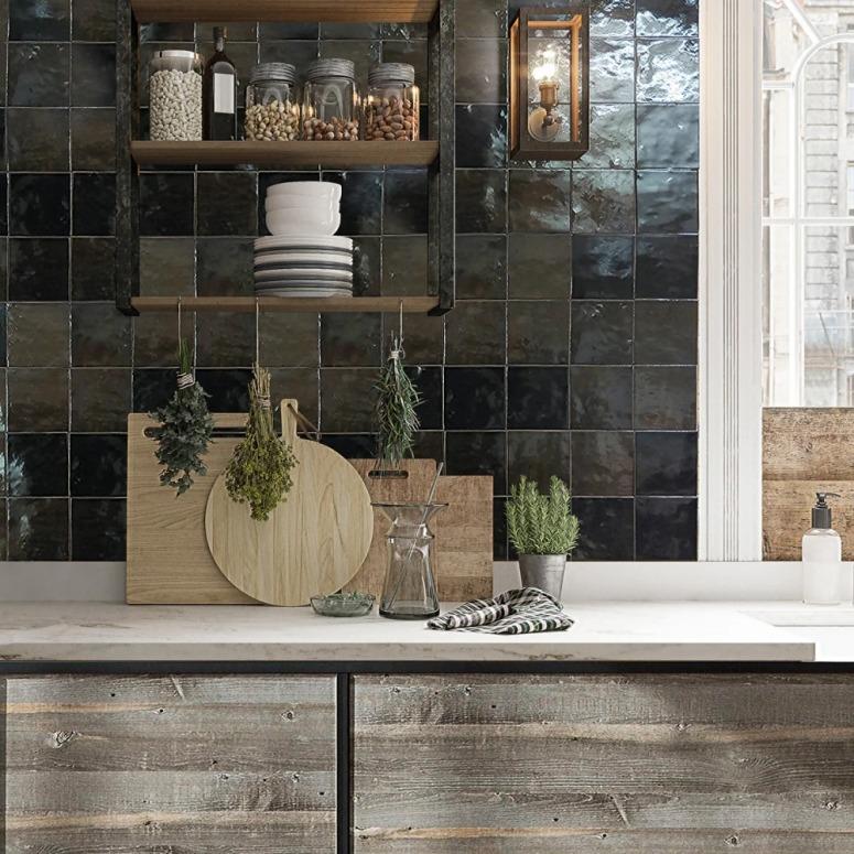
Best Colors for Ceramic Tiles: Neutral tones like white, grey, and beige work well in any kitchen. Bold options like cobalt blue or deep green can create a statement backsplash.
2. Porcelain Tiles
Porcelain tiles are denser and more resistant to moisture, making them perfect for kitchen floors.
Best Colors for Porcelain Tiles: Earth tones such as taupe, sand, and grey are popular choices for floors. Choose darker shades to create a dramatic look or light colors for a more airy feel.
3. Glass Tiles
Glass tiles reflect light beautifully, making them a great option for backsplashes.
Best Colors for Glass Tiles: Bold colors like emerald green or sapphire blue add elegance and character to backsplashes. Neutral or translucent glass tiles in white or grey offer a more understated aesthetic.
4. Natural Stone Tiles
Natural stone, such as marble, slate or travertine, adds timeless appeal. Each piece has unique color variations, giving your kitchen a one-of-a-kind look.
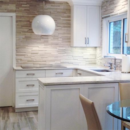
Best Colors for Natural Stone: Stone tiles tend to come in earthy hues—such as cream, tan and grey—but marble tiles are also available in stunning whites and blacks with veining.
Mixing and Matching Tile Colors for a Dynamic Look

Combining different colors can create visual interest and add depth to your kitchen design. Here are a few tips for mixing and matching:
1. Choose a Dominant and Accent Color
Select one primary color that covers most of the space (such as white tiles) and an accent color to use sparingly (such as blue glass tiles on the backsplash). This ensures that your kitchen doesn’t feel too busy.
2. Play with Patterns
Incorporating patterns can add flair to your kitchen. Try combining solid-colored tiles with patterned ones, or use geometric shapes to create a feature wall. Moroccan-inspired tiles, for example, bring bold colors and intricate designs to the space.
3. Use Different Materials for Variety
Mixing materials—like combining ceramic tiles with glass mosaics—adds dimension to your kitchen. For example, a glass tile backsplash with porcelain floor tiles creates a balance between sleek and matte finishes.
4. Stick to a Cohesive Theme
When mixing colors and materials, it’s essential to maintain a cohesive theme. If you’re aiming for a rustic look, for instance, choose earthy tones and textured tiles. For a modern style, opt for sleek materials in cool tones.
Creating a Harmonious Kitchen Design with the Right Tile Colors
Choosing tile colors that complement your cabinetry, appliances and decor can transform your kitchen into a space that feels both functional and inviting. Consider how tile colors work with your cabinets, appliances and overall color scheme, and don’t be afraid to mix and match different materials and tones. Whether you opt for the timeless appeal of natural stone, the versatility of porcelain or the elegance of glass tiles, the right color choices will tie your kitchen together beautifully.
Take your time exploring different tile combinations and materials, and let your creativity shine. Whether you prefer a neutral palette with subtle contrasts or a bold design with vibrant colors, your kitchen tiles have the power to enhance your space in ways you never imagined. Happy designing!