
How Do You Design Around a Bold Tile So the Space Still Feels Balanced?
Bold tile can become one of the strongest design elements in a room, whether it brings in pattern, saturated color, unusual shape, or handcrafted variation.
The easiest way to keep the space balanced is to decide where the tile should be the focal point, then let the surrounding surfaces play a quieter supporting role. Cabinets, countertops, paint, flooring, grout, and fixtures can all help reinforce the tile without competing with it.
When shopping online, samples are especially useful with statement tile because color and pattern can feel much stronger across a full surface than they do in a product photo.
Quick Answer: How Do You Balance Bold Tile?
Start by giving the bold tile one clear visual role, then use simpler colors, patterns, and finishes around it.
A balanced design usually includes:
- One primary statement surface
- Simpler surrounding field tile or finishes
- Colors pulled from the bold tile
- Limited competing patterns
- Thoughtful pattern scale
- Grout that supports the design
- Consistent undertones throughout the room
- Samples viewed with the surrounding materials
Bold tile does not need to be toned down. It simply needs enough visual breathing room to remain the intentional focal point.
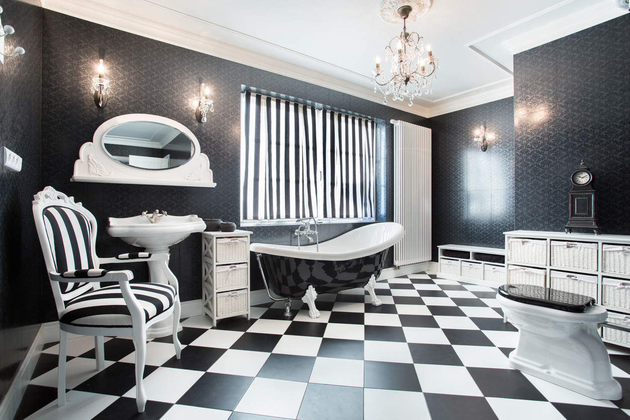
Ways to Design Around Bold Tile
There are several ways to make a strong tile feel connected to the rest of the room.
Pair It With Simpler Surfaces
Plain or lightly textured surfaces can give a bold tile room to stand out.
Best for:
- Patterned backsplashes
- Statement bathroom floors
- Decorative feature walls
- Artisan tile installations
What to know:
- Neutral does not have to mean plain white
- Simple surfaces can still include texture and subtle variation
- Avoid adding another strong pattern directly beside the statement tile
- Repeating one color elsewhere can connect the room
Pull Colors From the Tile
Use one or two colors already present in the tile as references for nearby finishes.
Best for:
- Multicolor patterned tile
- Decorative mosaics
- Handcrafted tile
- Colorful backsplashes
What to know:
- Cabinet, wall, or grout colors can repeat a tile undertone
- You do not need to match colors exactly
- Small repeated accents can make the palette feel intentional
- Too many unrelated colors can make the design feel busy
Use Contrast Intentionally
Contrast can make bold tile feel even stronger without making the room chaotic.
Best for:
- Dark tile with light cabinetry
- Colorful tile in neutral rooms
- Graphic black-and-white patterns
- Strong feature walls
What to know:
- Decide whether you want sharp or subtle contrast
- Keep other major surfaces relatively restrained
- Use repeated tones to connect contrasting finishes
- Consider the full room rather than one surface at a time
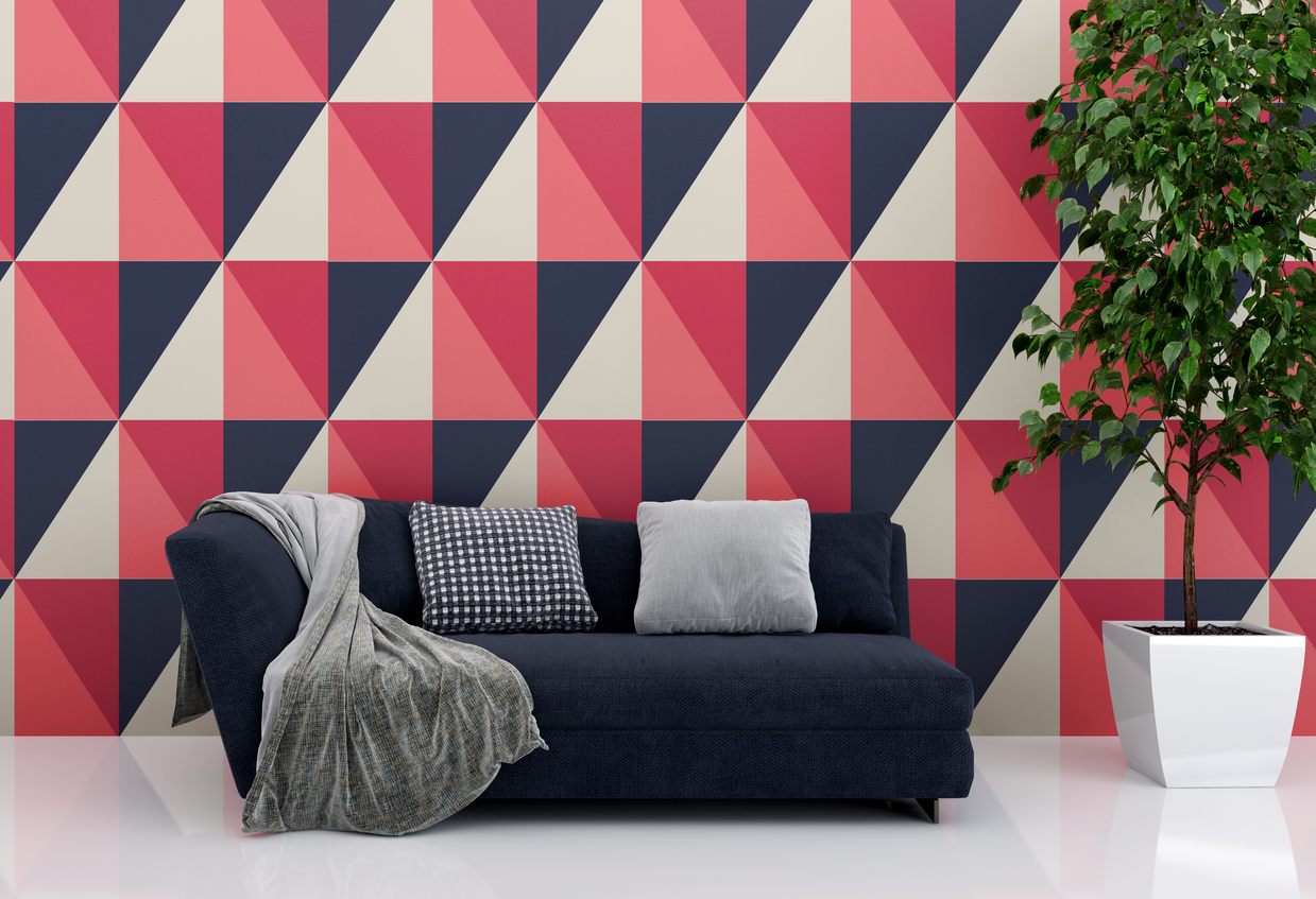
Pattern Scale & Visual Breathing Room
The amount of tile used can matter just as much as the pattern itself.
Best for:
- Large patterned floors
- Full-height backsplashes
- Decorative shower walls
- Smaller accent areas
What to know:
A detailed pattern may feel subtle on a single sample but much more active once repeated across an entire wall or floor. Larger patterns may need more uninterrupted surface area to read clearly, while intricate designs can work especially well in smaller focal areas.
Leaving quieter surfaces around the tile gives the eye somewhere to rest and helps the statement surface feel more deliberate.
How to Build a Balanced Room Around Bold Tile
A few decisions can help keep the design cohesive from the beginning.
Choose the Focal Surface
Decide where the bold tile will have the most impact.
Common choices include:
- Kitchen backsplash
- Bathroom floor
- Shower wall
- Entryway
- Fireplace surround
Try to avoid giving several unrelated surfaces equal visual weight.
Identify the Tile's Main Colors
Look beyond the most noticeable color.
Consider:
- Background color
- Accent colors
- Warm or cool undertones
- Grout possibilities
- Natural variation
These colors can help guide the rest of the room.
Keep Nearby Patterns Simple
If the tile already has strong movement, let surrounding finishes be more restrained.
This might mean:
- Simpler countertops
- Solid cabinetry
- Quiet wall colors
- Less patterned flooring
- Minimal decorative accents
The goal is contrast in visual intensity, not necessarily contrast in color.
Order Samples Together
Compare the statement tile with the actual surrounding materials.
Place samples beside:
- Cabinets
- Countertops
- Paint
- Flooring
- Hardware or fixtures
View them under both daylight and the lighting used in the room.
Plan Grout and Layout Early
Grout and layout can either soften or emphasize a bold design.
Consider:
- Coordinating grout for a more continuous pattern
- Contrasting grout to emphasize tile shape
- Pattern centering
- Cuts around edges
- Transitions to simpler tile
These decisions can significantly change the finished appearance.
Common Mistakes to Avoid
Bold tile usually works best when the rest of the design supports it.
- Using several competing statement patterns
- Trying to match every color in the tile
- Choosing surrounding finishes before seeing tile samples together
- Ignoring the scale of the repeated pattern
- Selecting highly patterned countertops beside patterned tile
- Treating grout as an afterthought
- Using bold tile on too many unrelated surfaces
- Judging the design from a single tile instead of the full repeat
Tips to Get the Best Results
- Choose one main focal surface
- Pair bold tile with simpler supporting finishes
- Repeat one or two colors elsewhere in the room
- Keep competing patterns to a minimum
- Consider how the pattern repeats across the full surface
- Order samples and compare everything together
- Choose grout while planning the overall design
- Step back and evaluate the entire room, not just the tile
A bold tile feels balanced when it has a clear purpose and the surrounding materials give it enough space to stand out.
Frequently Asked Questions
Should bold tile be the only pattern in a room?
Not necessarily, but additional patterns should usually be quieter or different in scale so they do not compete for attention.
What colors work best with bold patterned tile?
Colors already present in the tile are often a good starting point. Pulling a background or accent tone into paint, cabinetry, or other finishes can help connect the room.
Can you use bold tile in a small space?
Yes. A small bathroom, backsplash, or entryway can be an effective place for bold tile. Consider the pattern scale and how much of the surface will be visible.
Should grout match bold tile?
It depends on the desired effect. Coordinating grout can let the pattern feel more continuous, while contrasting grout can emphasize individual tile shapes and layout.
Should I order samples before choosing a bold tile?
Yes. Samples help you judge actual color, pattern scale, texture, finish, and how the tile works with the other materials in the space before placing a larger order.