
How Do You Choose Kitchen Tile Colors That Work With Cabinets and Countertops?
Choosing kitchen tile color is easier when you look at the room as a whole instead of treating the tile as a separate decision. Cabinets and countertops usually cover more visual space, so they are a good starting point for narrowing down tile colors.
The tile can closely coordinate with those finishes, introduce contrast, or bring in a color that gives the kitchen more personality. Undertones, pattern, lighting, grout, and the amount of tile being installed all affect how the combination feels.
When shopping online, ordering samples lets you compare actual tile colors against your cabinets and countertops rather than relying only on how they appear on a screen.
Quick Answer: How Do You Match Kitchen Tile With Cabinets and Countertops?
Start with the undertones and amount of visual movement already present in your cabinets and countertops, then choose tile that either coordinates with them or creates intentional contrast.
When comparing kitchen tile colors:
- Identify whether your cabinets feel warm, cool, or neutral
- Look at the main colors and veining in your countertop
- Use simpler tile when countertops already have strong movement
- Add color or pattern when cabinets and counters are more restrained
- Decide whether you want contrast or a softer tonal look
- Consider grout as part of the color combination
- View samples under your actual kitchen lighting
- Compare everything together before placing a larger order
The goal is not to match every surface exactly. A good kitchen palette gives the finishes enough connection to feel intentional while still allowing each one to have its own role.

Kitchen Tile Color Approaches to Consider
There is more than one way to coordinate kitchen tile. The best direction depends on how much contrast, color, and visual interest you want.
Soft & Coordinated Colors
A tonal approach uses tile that shares similar colors or undertones with the cabinets and countertops.
Best for:
- Calm kitchens
- Neutral palettes
- Classic designs
- Spaces with detailed countertops
What to know:
- Warm cabinets often pair naturally with warm whites, creams, earth tones, or related colors
- Cooler finishes may work better with crisp whites, grays, blues, or cooler neutrals
- Colors do not need to match exactly
- Slight variation can keep a neutral kitchen from feeling flat
Contrasting Tile Colors
Contrast makes the tile more noticeable and can help define a backsplash or floor.
Best for:
- Modern kitchens
- Statement backsplashes
- Light cabinets with darker tile
- Dark cabinets with lighter tile
What to know:
- Contrast can highlight tile shape and layout
- Dark and light combinations create a stronger visual break
- Repeating a smaller accent color elsewhere can connect the room
- Consider how strong the contrast will feel across the full surface
Colorful & Patterned Tile
Color or pattern can give a kitchen more personality when the larger surfaces are relatively simple.
Best for:
- Neutral cabinets
- Simple countertops
- Decorative backsplashes
- Design forward spaces
What to know:
- Pulling one color from the countertop can create connection
- Pattern looks stronger across a full wall than on a single sample
- Simpler surrounding surfaces allow decorative tile to stand out
- Samples help you judge saturation and pattern scale
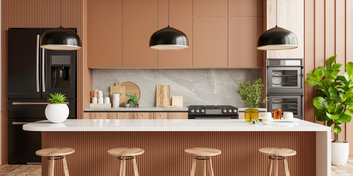
Start With the Cabinets & Countertops
Cabinets and countertops are usually the most permanent visual elements in the kitchen, so they can guide the tile decision.
Best for:
- Narrowing down color families
- Identifying warm or cool undertones
- Deciding how much pattern the room can handle
- Creating a more connected overall design
What to know:
Look at more than the dominant color. A white countertop may contain gray, beige, gold, or other veining that can become a useful reference for the tile. Wood cabinets may also lean warmer, redder, grayer, or more neutral depending on the finish.
If the countertop already has strong pattern or movement, a quieter tile can give it room to stand out. When cabinets and countertops are simple, the tile can take on more color, pattern, or texture.
How to Choose Kitchen Tile Colors Online
A few comparisons can make choosing color online much easier.
Identify Your Existing Undertones
Start with your cabinets and countertops.
Ask whether they feel:
- Warm
- Cool
- Neutral
- Earthy
- Bright
- Deep or dramatic
This gives you a more useful starting point than simply looking for a tile labeled white, gray, or beige.
Decide Whether You Want Contrast
Think about the role the tile should play.
You may want it to:
- Blend with the countertop
- Coordinate with the cabinets
- Add subtle contrast
- Introduce color
- Become a focal point
Knowing this helps narrow the color range quickly.
Order Samples and Compare Them Together
Color is difficult to judge accurately from a screen.
Place samples:
- Against the cabinets
- Beside the countertop
- Near the flooring
- Under natural daylight
- Under kitchen lighting
Look at all of the surfaces together rather than evaluating the tile by itself.
Consider Grout Color
Grout can change how light, dark, busy, or graphic the finished tile appears.
Consider:
- Matching grout for a quieter look
- Contrasting grout to emphasize tile shape
- Warm versus cool grout tones
- How visible the grout will be across the surface
Treat grout as part of the color palette rather than an afterthought.
Look at the Whole Kitchen
Step back and consider how the tile works with the entire room.
Think about:
- Flooring
- Hardware
- Appliances
- Wall color
- Lighting
- Nearby finishes
A color that looks right next to the countertop may feel different once every element is considered together.
Common Mistakes to Avoid
Kitchen tile color decisions are easier when you avoid trying to match everything perfectly.
- Choosing tile from an online image without ordering a sample
- Matching colors without comparing their undertones
- Selecting a busy backsplash beside a highly patterned countertop
- Ignoring how kitchen lighting changes color
- Trying to make every surface exactly the same shade
- Forgetting how grout affects the finished appearance
- Choosing color without considering the amount of tile being installed
- Looking at the tile separately from the rest of the kitchen
Tips to Get the Best Results
- Start with cabinets and countertops before choosing tile
- Compare undertones instead of relying only on color names
- Keep tile simpler when countertops have strong movement
- Use contrast when you want the tile to stand out
- Order several samples rather than comparing only one
- View samples during different times of day
- Choose grout along with the tile
- Look at the full kitchen before making the final decision
Taking time to compare samples with the surfaces already in your kitchen can make choosing tile colors online much easier.
Frequently Asked Questions
Should kitchen tile match the cabinets?
It does not need to match exactly. Tile can coordinate through similar undertones or create intentional contrast with the cabinets depending on the look you want.
Should backsplash tile match the countertop?
Not necessarily. A backsplash can repeat a color from the countertop, stay within the same color family, or provide contrast. If the countertop has a strong pattern, simpler backsplash tile often creates better balance.
What backsplash colors work with white cabinets?
White cabinets are flexible and can work with neutral, colorful, dark, or patterned backsplash tile. Pay attention to whether the cabinet white has warm or cool undertones before choosing.
Can you mix warm and cool colors in a kitchen?
Yes, but having a connecting element helps. A countertop, grout color, hardware finish, or patterned tile that contains both tones can make the combination feel more intentional.
Should I order kitchen tile samples before choosing a color?
Yes. Samples let you compare the actual color, undertone, texture, and finish against your cabinets and countertops under the lighting in your kitchen.